Many stores rely on single images, yet combining images for product shots often communicates more information without overwhelming the viewer. With the right layouts, shoppers understand size, features, and usage faster. This article covers practical layout ideas that help product images look clearer and convert better.
Single product photos rarely tell the whole story. Buyers want to see how a product works, how large it is, and how it looks in real situations. Combined product shots make that easier without forcing visitors to scroll through many photos.
Well-structured visuals improve clarity and help reduce hesitation. A strong product image layout usually communicates three things at once:
Clear combined images also reduce confusion on mobile screens where space is limited. When shoppers understand a product quickly, they move toward purchase decisions with more confidence.
Creating polished product layouts does not require advanced design skills. Modern tools make combining product photos accessible even for small businesses or individual sellers.
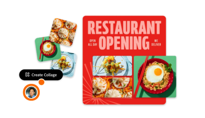
When combining your images for product shots, simple editors allow precise alignment, clean spacing, and consistent backgrounds without complicated steps. Tools designed for quick layouts make it easier to maintain visual consistency across a product catalog.
The best tools usually provide:
Consistent layouts help shoppers recognize product listings faster, which improves browsing comfort and builds visual trust.
Side by side product layouts work well when the goal is simple comparison or additional perspective. A main image on the left and a secondary image on the right keeps the composition balanced and easy to scan.
This layout works especially well for products with visible details such as electronics, accessories, or tools. Buyers can immediately compare angles or features without switching images.
Typical side by side uses include:
Keep the primary photo slightly larger than the secondary one. Visual hierarchy helps direct attention while still providing extra information.
Grid layouts present multiple angles in a compact format. They are especially useful when products include several features that buyers need to evaluate quickly.
A simple grid usually includes one large main image and smaller supporting images arranged around it.
The advantage of a grid layout lies in structured information delivery. Visitors can scan images quickly without feeling overwhelmed.
Consistency matters when using grids. Equal spacing and aligned edges make the presentation look professional and trustworthy.
Combined product shots reduce browsing time because users understand features faster when visual information appears together in a structured format.
Some products depend heavily on quality details. Materials, textures, and finishing touches often influence purchase decisions more than overall shape.
A main image with detail close ups works particularly well for handmade items, apparel, and accessories. Buyers want reassurance that materials look as good in reality as they do online.
Effective detail layouts often include:
This layout balances storytelling and clarity. Buyers see both the full product and its important characteristics in one glance.
Eye tracking studies show users focus first on the largest visual element, then move to smaller supporting images. Strong visual hierarchy improves comprehension and reduces decision time.
Context helps shoppers imagine ownership. A product displayed in real use often feels more trustworthy than a studio shot alone.
Lifestyle combinations work best when the product remains easy to identify. The product should still be clearly visible even within a real environment.
Strong lifestyle layouts often include:
Lifestyle combinations often increase perceived value because they help customers picture the product in their daily routines. This type of presentation works particularly well for home items, clothing, and personal accessories.
Transformation layouts help communicate results quickly. Products that improve appearance or performance benefit especially from this approach.
Before and after layouts must remain honest and clear. Misleading images reduce trust and lead to returns.
Good transformation layouts usually follow simple rules:
A structured transformation layout gives shoppers immediate visual proof without requiring long explanations.
Accurate product visuals support customer trust and reduce product returns. Clear expectations often lead to better long term store performance.
Even simple layouts can look unprofessional if spacing and backgrounds vary from one image to another. Consistency builds recognition and trust across product listings.
Spacing and alignment create visual order. Shoppers may not consciously notice alignment, but they notice when something looks uneven.
A consistent layout usually includes:
Neutral backgrounds remain the safest choice for most stores. White and light gray backgrounds keep attention focused on the product while maintaining a clean appearance.
Careful alignment helps product images look intentional rather than improvised.
Not every layout works equally well for every product. Testing helps identify which combinations perform best for a specific audience.
Simple testing methods provide useful insights without requiring complex analytics tools.
Practical testing steps include:
Small layout improvements often produce noticeable gains in buyer confidence. Even minor adjustments such as image order or spacing can improve clarity.
Regular testing keeps product visuals aligned with customer expectations and browsing habits.
Good product images do more than show an item. They help customers understand it quickly and build confidence before purchase. Combining images for product shots allows stores to communicate more information without increasing visual clutter.
Simple layouts often perform better than complex designs. Clear structure, consistent spacing, and logical image placement make product pages easier to scan and understand. When images explain the product clearly, customers spend less time guessing and more time deciding.
Well designed combined product shots improve both presentation quality and customer trust. Over time, consistent layouts create a stronger visual identity and support better conversion rates across the entire store.


